Monthly Archives: January 2013
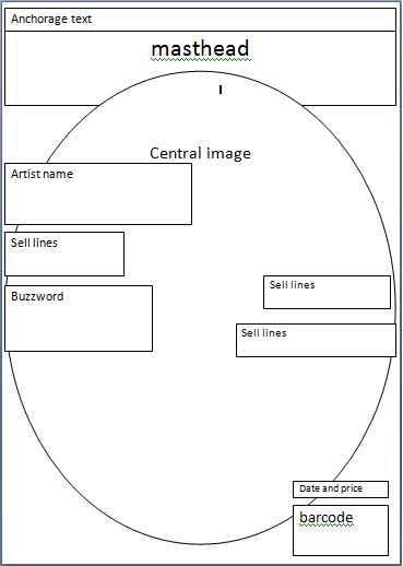
Music magazine front cover plan 2
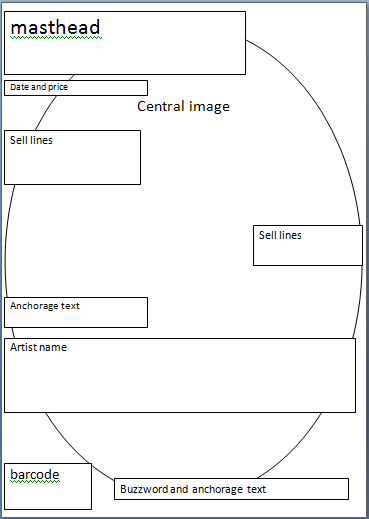
Music magazine front cover plan 1
 Image
Image
Vibe Music Magazine
The masthead is bold and the colour makes it stand out, It is hidden behind the models head which shows that the magazine is confident there name will be recognised.
The centeral image is of singer and actor T.I, this shows that it is aimed at mostly an R&B based audience, he is looking directly forward so this draws you in.
The theme is white writing, it stands out on the background and with the centeral image.
The layout is not too cluttered, they put words and numbers in big or smaller letters depending on how much information there is and if they want it to catch your attention.
The cover lines are all to the sides of the centeral image, it is advertising other artists, extras and ‘exclusives’.
Buzz words such as ‘exclusive’, ‘hurry’and ‘special report’ have been used.
Kerrang Music magazine
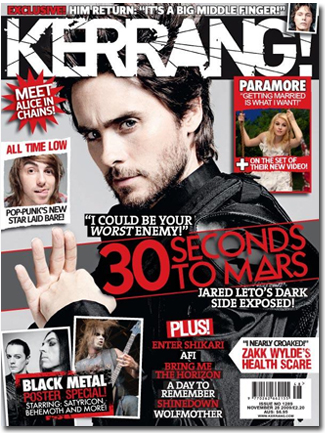
The Masthead is bold and draws your attention, it is cracked and ‘dark’ which indicates the kind of music in the magazine.
The central image still draws your attention but is hidden behind lots of other things that are going on on the cover. It is on a grey background so it stands out. The model is jared leto, showing the genre of music they focus on.
The theme is black, red and white. It is quite ‘rocky’ which works well with the genre of the music.
They layout is quite cluttered and has no particular order, personally i don’t like it its too busy.
The cover lines are mostly showing what artist they will be talking about.
They have used buzz words such as ‘plus’ ‘meet’ and ‘exclusive’. These draw you in.
Blender Music magazine

The Masthead is bold and draws your attention, it is hidden by the central image which shows that blender is confident its brand will be recognised.
The central image is on a white background which makes it stand out, it is clear and works well with the colour scheme. The model is Katy Perry which shows they target an audience who like current mainstream music.
The theme is black, white and pink, the lettering is all bold and large so it stands out.
The layout is straightforward and not too cluttered, there is a mix match of large and smaller writing which indicates what they want you too read first.
The cover lines indicate that this magazine is for young adult and adults.
They have used buzz words such as ‘must-have’, ‘free’ and ‘plus’.
Q Music magazine

The masthead is bold and the colours used contrast really well. I like where the centeral image is placed and the image itself, the 300th issue logo is good to draw readers in, the colours used or good because the gold represents history and power. The anchorage text is colour coded red and black and i think theese colours work together nicely, the structure is intresting and draws you in. The White background of the whole magazine really emphases the centeral image and text.
NME Music magazine
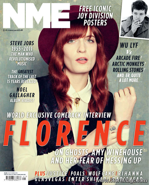
This is another NME music magazine, I like this magazine and it’s layout. The masthead is bold, punchy and draws your attention, the placement on the left hand side was strategically put there so it is visible when stacked with other magazines.The image in the middle of the magazine which grabs you attention. The Central Image is clear and uncluttered and simple, I also like that it looks quite vintage. There are a few buzz words that draw our attention such as ‘plus’ and ‘greatest’ which are both in bold colours.
The graphic features of this front page have been cleverly done, they have used contrasting colours to words stand out and there is a constant colour theme of black, white and orange this has a nice minimal effect, her name across the middle is in orange so it stands out it shows you straight away who this magazine mainly features. There is one other image used in the right hand corner and is advertising a poster inside which automatically draws you in. There are alot of sell lines but it is not overused. They are all placed well and or short sentences so it is not to complicated. The title of the magazine is short and too the point. The barcode is in the left hand bottom corner and are nicely places out of the way not drawing too much attention and the date and price are below the title of the magzine, it is in a different colour so it is easier to see.
NME Music magazine

NME music magazine, I like this magazine and it’s layout. The masthead is bold, punchy and draws your attention, the placement on the left hand side was strategically put there so it is visible when stacked with other magazines.The image in the middle of the magazine which grabs you attention. The Central Image is clear and uncluttered, you can see each band members face directly and the white background draws our attention to them. There are a few buzz words that draw our attention such as ‘win’, ‘free’ and ‘new’ that are all bold in red so your attention is drawn, they stand out on the white background. The graphic features of this front page have been cleverly done, they have used contrasting colours to words stand out and there is a constant colour theme of black, white and red which has a nice effect, the banner across the middle clearly states the band and in the centeral image and the text is in white so it stands out, the placement is very well done and it is not over cluttered or too fussy. There is one other image used in the right hand corner and is advertising a poster inside which automatically draws you in. There are alot of sell lines but it is not overused. They are all placed well and or short sentences so it is not to complicated. The title of the magazine is short and too the point. The price and barcode or in the left hand bottom corner and are nicely places out of the way not drawing too much attention and the date is vertical to the title of the magzine, it is in a different font so it is easier to see.
Music Magazine
This section of the coursework unit is to create a music magazine with front cover, contents and Double page spread, with a minimum of 4 of my own images.
