
This is my finished double page spread.
This is my finished double page spread.
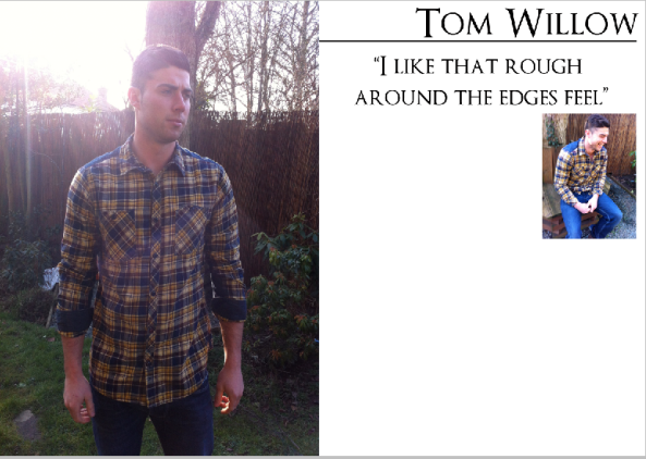
For my double page spread this is the layout I’m going with, I’ve seen various types of layout but I like the style of the main picture on one side and text, title and maybe smaller image on the other side. I might try with the quote on the left hand side with image if it looks more proffesional.

This is my final Draft Music magazine contents page, I’ve used two images and relevant text, I tried to keep the bands mentioned within the same genre, I’ve created a section called ‘plus’ this section is the regulars in the magazine, what the reader would expect to be in the magazine every time. The only thing I want to change is the features panel I want to include sell lines from the front page.

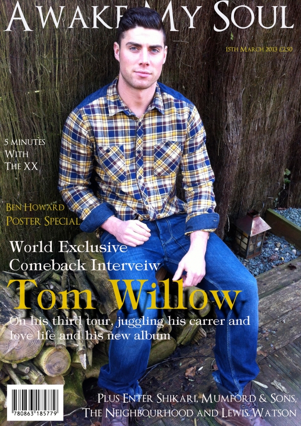
This is the finished Music magazine front cover, I decided on this central Image because his focus is forward and it draws you in also he is directly centre so I could evenly spread sell lines on either side. I played around with Masthead, I liked the font type, size and colour but I wasn’t sure weither to have it behind the head of the model or over the top, I think with the models head over the text it looks more professional so I had to move the masthead up slightly so you didn’t lose all of the letter M and E, with the masthead behind the models head it gives the illusion that my magazine is well known and that I am confident it will be recognised even though not all of it is showing. The date and price are just below the masthead so it is still visible but I’ve used much smaller text size so it isn’t drawing attention away from more important features. The text i’ve used for the sell lines is relevant to the kind of magazine I wanted to make, I’ve gone for a Indie/Folky genre magaizne, I’ve featured alot of bands that fit into this criteria. I’ve put the name of the artist featured on the front cover alot larger than the rest of the text so it stands out, I’ve also used a shadowing effect, I’ve put what he is going to talk about above his name and then more details underneath. I’ve put the barcode in the left hand corner so it is still visible but also isn’t drawing attention away from anything else. The colour theme I’ve used is white, yelow I wanted the text colour to tie in with the colours of the central image which is blue and yelow.

This is the complete layout I want for my music magazine contents page, the one thing I will change is the image of the artist that i featured throughout, his focus is in a different direction and the light background of the image and the content page being white doent work well together.

This is the layout I want for my magazine contents page.

This is a basic version of the layour I want for my contents page.

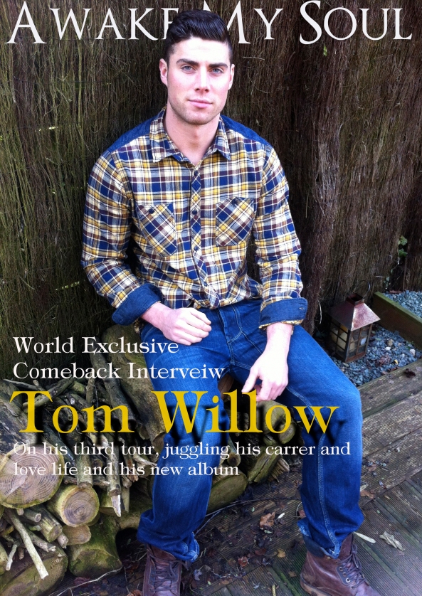
I’m now at what I want I almost want as my front cover, one last change I want to make is I want the masthead behind the head of the centeral image. To do thi I will just have to move it up slightly and then edit it on photoshop, I think this will make it look more proffesional.
